The Angular team has added experimental support for Material 3 theming (you can read more about it here). While the blog post redirects you to a documentation page (found here), it doesn't really cover the "getting started" part of the setup.
The scope of this post would be to help with that. Let's get started.
Setting up Angular Material
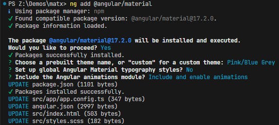
The first step is to install/add Angular Material as you normally would, by executing ng add @angular/material:

The chosen theme will have an effect only on the components using Material 2 styles. Material 3 ones will have their own theming.
After we have the base Material package installed, we'll need to install the @angular/material-experimental package. There's no schematic for this (as of today), so we'll have to simply install it by running npm i @angular/material-experimental :

This is more or less everything we have to set up and install to get it working. Onto the theming itself!
Configuring & Setting up themes
A lot of information is provided in the links from the article's initial paragraph regarding the new way of theming the new Material 3 components, but we'll be aiming to set up a very minimal example to showcase the way of working. If you're interested in all the new options, the docs are definitely a great read.
Intermediate step to set up Material components
We'll have a primary and accent button set up in this example. For this, all we need to do is to import the MatButtonModule from @angular/material/button, add the directives to the buttons and we're off to the races:
import { Component } from '@angular/core';
import { MatButtonModule } from '@angular/material/button';

@Component({
  selector: 'app-root',
  standalone: true,
  imports: [MatButtonModule],
  template: `
  <div class="container">
    <button mat-raised-button color="primary">Primary</button>
    <button mat-raised-button color="accent">Tertiary</button>
  </div>
  `,
  styleUrl: './app.component.scss'
})
export class AppComponent { }
This will result in the following output (still using Material 2):

Changing the Material components to use Material 3 styling
With the buttons being all set up with their Material directives, we'll have to define and set a new Material 3 theme for them to use. We do that by defining a new theme in our main styles.scss file using the exposed palettes available in @angular/material-experimental:
@use '@angular/material-experimental' as matx;

$m3-custom: (
  color: (
    primary: matx.$m3-magenta-palette,
    tertiary: matx.$m3-red-palette
  )
);

$light-theme: matx.define-theme($m3-custom);
This will define the main palette, and also a tertiary one, in case we'd like to use it. We'll be using the tertiary one for the accent button.
With the theme being defined, we need to tell the components to use these ones, instead of the default Material 2 ones, and our final styles.css file will look as such:
@use "@angular/material" as mat;
@use '@angular/material-experimental' as matx;

$m3-custom: (
  color: (
    primary: matx.$m3-magenta-palette,
    tertiary: matx.$m3-red-palette
  )
);

$light-theme: matx.define-theme($m3-custom);

html, body {
  height: 100%;
  @include mat.button-theme($light-theme);
}

.accent-btn {
  @include mat.button-color($light-theme, $color-variant: tertiary);
}
As of Material 3, the use of the color attribute is no longer recommended, so we're using a separate accent-btn class here to change the color variant of the button to the tertiary palette. This also means that we can remove the attribute and add the class in our HTML:
import { Component } from '@angular/core';
import { MatButtonModule } from '@angular/material/button';

@Component({
  selector: 'app-root',
  standalone: true,
  imports: [MatButtonModule],
  template: `
  <div class="container">
    <button mat-raised-button>Primary</button>
    <button mat-raised-button class="accent-btn">Accent</button>
  </div>
  `,
  styleUrl: './app.component.scss'
})
export class AppComponent { }
With that, we're done!

Closing thoughts
All of the code above can be found in this GitHub repository and a live example of it is available in this StackBlitz.
Although only the buttons were covered here, all components are swapped over to the Material 3 themes in the same fashion: using @include mat.COMPONENT_PLACEHOLDER-theme(THEME_PLACEHOLDER);, where COMPONENT_PLACEHOLDER was button for us, and the theme was named $light-theme.
Keep in mind that Material 3 is still under Experimental Support in Angular 17.2, so things might change during further development. This article is targeted towards people who want to play around with the new styling, and prepare for a migration from Material 2 to Material 3.
